
French Tennis Brand Opens Striking New Flagship Store in Historic Hong Kong Building
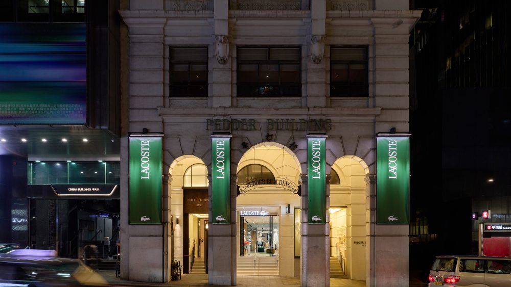
The world of luxury sportswear continues to evolve, and I find it fascinating how brands are increasingly focusing on creating destination retail experiences rather than simple shopping spaces. The latest example comes from a French tennis heritage brand that has just unveiled an impressive new flagship store in Hong Kong’s Central district, occupying a remarkable 3,750 square feet within the historic Pedder Building.
What strikes me most about this development is the thoughtful integration of local culture with brand heritage. The store sits within a Grade I listed building from the 1920s, renowned for its neo-classical architecture and distinctive arched arcades. This isn’t just about finding premium real estate – it’s about creating a narrative that connects French sporting elegance with Hong Kong’s unique urban identity.
The interior design philosophy here is particularly clever, in my opinion. The architectural elements of the historic building have been translated into graphic lines that guide customers through different product categories, from women’s and men’s collections to dedicated sports offerings. There’s even a specific area devoted to the brand’s iconic polo shirt collection, which I think demonstrates smart merchandising that honors the brand’s tennis roots.
For luxury retail enthusiasts and brand strategists, this flagship represents something significant. The store features exclusive Hong Kong-inspired merchandise, including a limited capsule collection showcasing the city’s famous skyline and locally-inspired patch designs. This kind of geographic customization is exactly what discerning consumers in major Asian markets expect from premium brands today.
The collaboration elements are where this project really shines, from my perspective. The brand commissioned Hong Kong artist Alvin c.k. Lam to create a painting inspired by the Pedder Building’s artistic heritage, while Belgian designer Mathilde Wittock contributed furniture pieces made from upcycled tennis balls. These aren’t just decorative elements – they’re conversation starters that create Instagram-worthy moments for customers.
Perhaps most striking is the neon installation that pays homage to Hong Kong’s legendary but disappearing neon signage culture. This detail shows genuine respect for local identity rather than simply imposing a global brand template. For international brands expanding into Asia, this approach offers valuable lessons about cultural sensitivity and authentic local engagement.
The timing of this opening, coinciding with major tennis tournaments, reinforces the brand’s sporting credentials while expanding its lifestyle appeal. As the CEO noted, while the brand originated from tennis, it has always represented something broader than pure sport – a philosophy that resonates particularly well in Hong Kong’s fashion-conscious market.
This flagship represents the brand’s seventh location in Hong Kong, suggesting strong local market confidence. For investors and retail analysts, this expansion pattern indicates healthy brand momentum in one of Asia’s most competitive luxury markets. However, for smaller sportswear brands, the level of investment and cultural research required for such authentic localization might be prohibitive.
The store launch also coincides with the brand’s recent visual identity refresh, including logo evolution and archival references to founder René Lacoste’s handwriting and original crocodile illustrations. This comprehensive brand renewal strategy, I believe, positions the company well for continued growth in premium sportswear segments where heritage and innovation must coexist.